Work / PUR Nail Spa
Their own work was the best thing about the salon, and the website hid it.
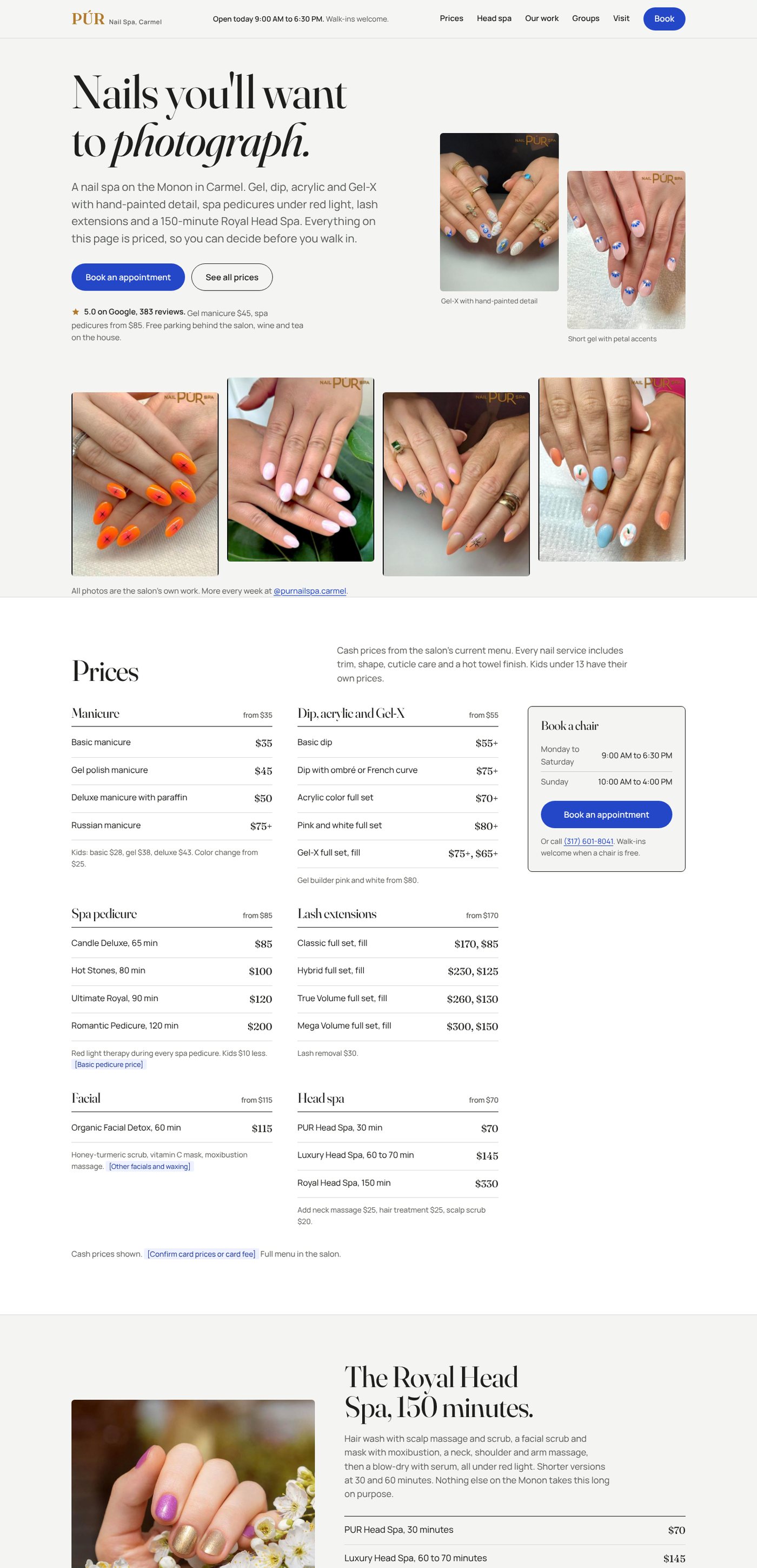
PUR has a 5.0 rating across 383 Google reviews, a gallery of hand-painted nail art with their logo on every photo, and a 150-minute head spa nobody else on the Monon offers. The current site opens with a policy popup, keeps every price inside a click-to-open window, leads with stock photos, and never mentions the rating. The concept reverses all four.
- Industry
- Nail spa, Carmel
- Type
- Unsolicited homepage concept, one page
- My role
- Research, design, copy, build
- Preview
- Open the concept site
What I found
I went through the live site on a laptop and a phone the way a new client would. A three-slide popup covers the page on arrival. Prices exist, but only inside modals you have to open one category at a time. The big homepage photos are stock; the salon's real work sits lower down in a gallery. The 5.0 Google rating appears nowhere. Hours are findable but not on the first screen.
Goal. Let someone decide to book within the first screen: see the work, see a price, see the hours, press one button that goes to the salon's existing booking system.
Rule I set myself. Nothing invented. Every price is from their current menu, every photo is theirs, every review is a real Google review with the client's first name. Anything I couldn't verify is marked in brackets on the page instead of guessed.
Design decisions
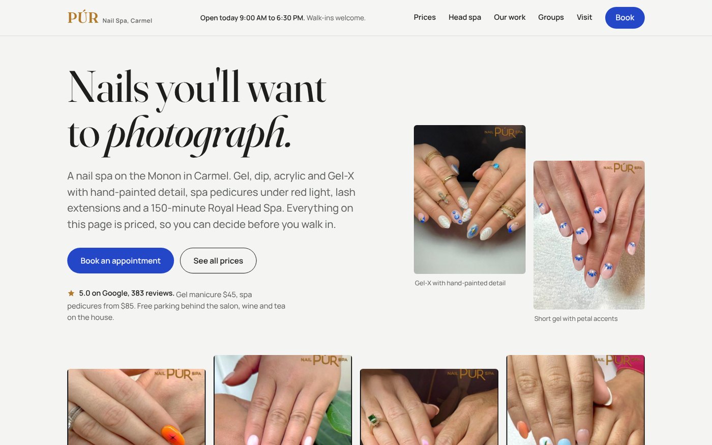
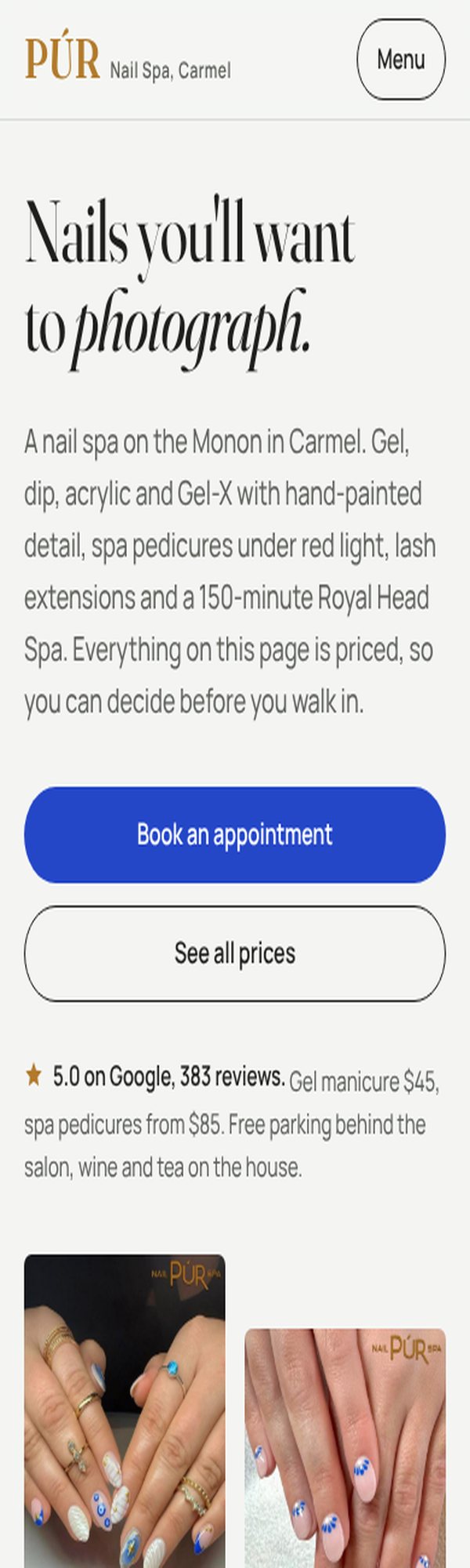
Three directions before one. I built three working versions first: one led by their photos, one that made the price list the whole first screen, one dark evening-spa treatment around the head spa. The photo-led direction won because it's the one a competitor can't copy; the price-first version's booking rail was folded into it.
Cool off-white, not cream. Their nail art is bright: tangerine, cobalt, shell white. A warm beige page would fight it. A cool off-white with charcoal type lets the photos carry the color.
A cobalt accent taken from their own work. The blue in the buttons is the blue of the evil-eye and petal designs in their gallery. It's the only color on the page that isn't in a photo.
Fraunces and Manrope. A soft, slightly playful serif for headlines, a quiet sans for everything else. Nail art is joyful; the type should be too, without turning into a template.
The rating goes above the fold. 5.0 across 383 reviews is the most persuasive fact the salon has. It sits under the buttons with a small gold star, then anchors a reviews section with three real quotes.
A booking rail that never leaves. Hours, a Book button and the phone number stay pinned beside the price list on desktop, so nobody reads prices and then has to scroll to act on them.
A working form for the things booking software can't do. Groups, gift cards and questions get a real form with validation and a sent state, running on the host's form service. One test submission confirmed it end to end.
What a real client gets
This page, with the brackets filled in: a confirmed basic-pedicure price, the card fee if there is one, a salon email instead of a personal Gmail, and Google reviews pulled in automatically so they stay current. Hosting and the inquiry form are included in the monthly fee.