Work / Royal Oak Society
A one-man shop whose website never showed the man.
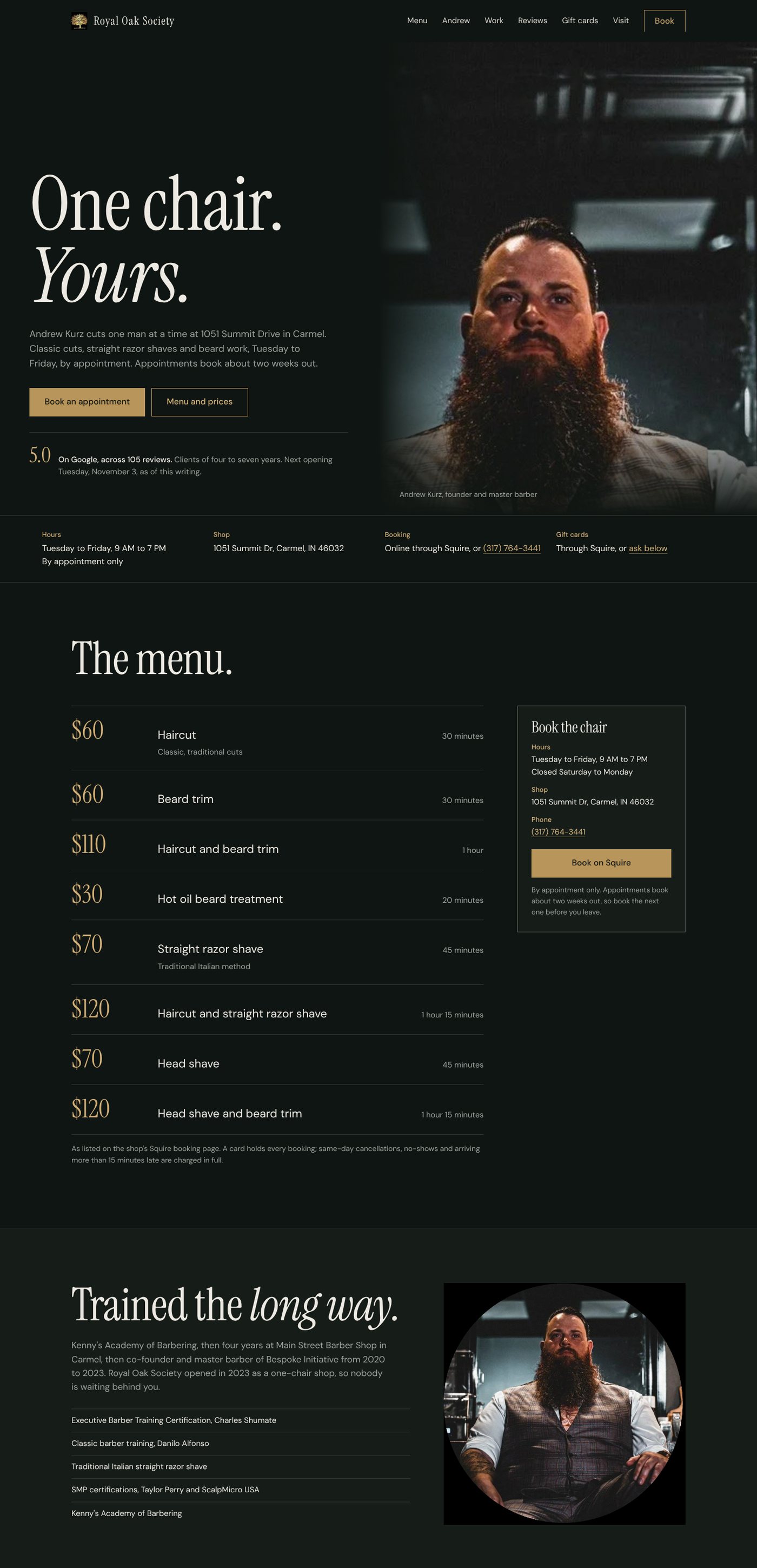
Andrew Kurz is booked about two weeks out and holds a 5.0 across 105 Google reviews, some from clients of seven years. His site opens with two buttons and the cancellation policy. There is no menu or pricing on it, no written address, and the reviews are pasted in as images a phone can't zoom and Google can't read. The concept puts him, his prices and his rating on the first screen.
- Industry
- Barbershop, Carmel
- Type
- Unsolicited homepage concept, one page
- My role
- Research, design, copy, build
- Preview
- Open the concept site
What I found
I went through the live site and the shop's Squire booking page on a laptop and a phone. The eight services and their prices exist only inside Squire, two clicks away. The address is a map with no text. Reviews are screenshots. The footer still says 2023 and "Cancelations" is misspelled twice. Meanwhile his next opening was two weeks out, which is the strongest sales argument a barber can have, and nothing on the site said so.
Goal. A man comparing Andrew to a $35 chain cut should see, on one screen, who cuts his hair, what it costs, that 105 people gave him five stars, and when the next chair is open.
Rule I set myself. Nothing invented. Prices and times from Squire, credentials from his own About page, three real Google reviews quoted with first names, his own photos from his Google listing. Anything unverifiable is bracketed on the page.
Design decisions
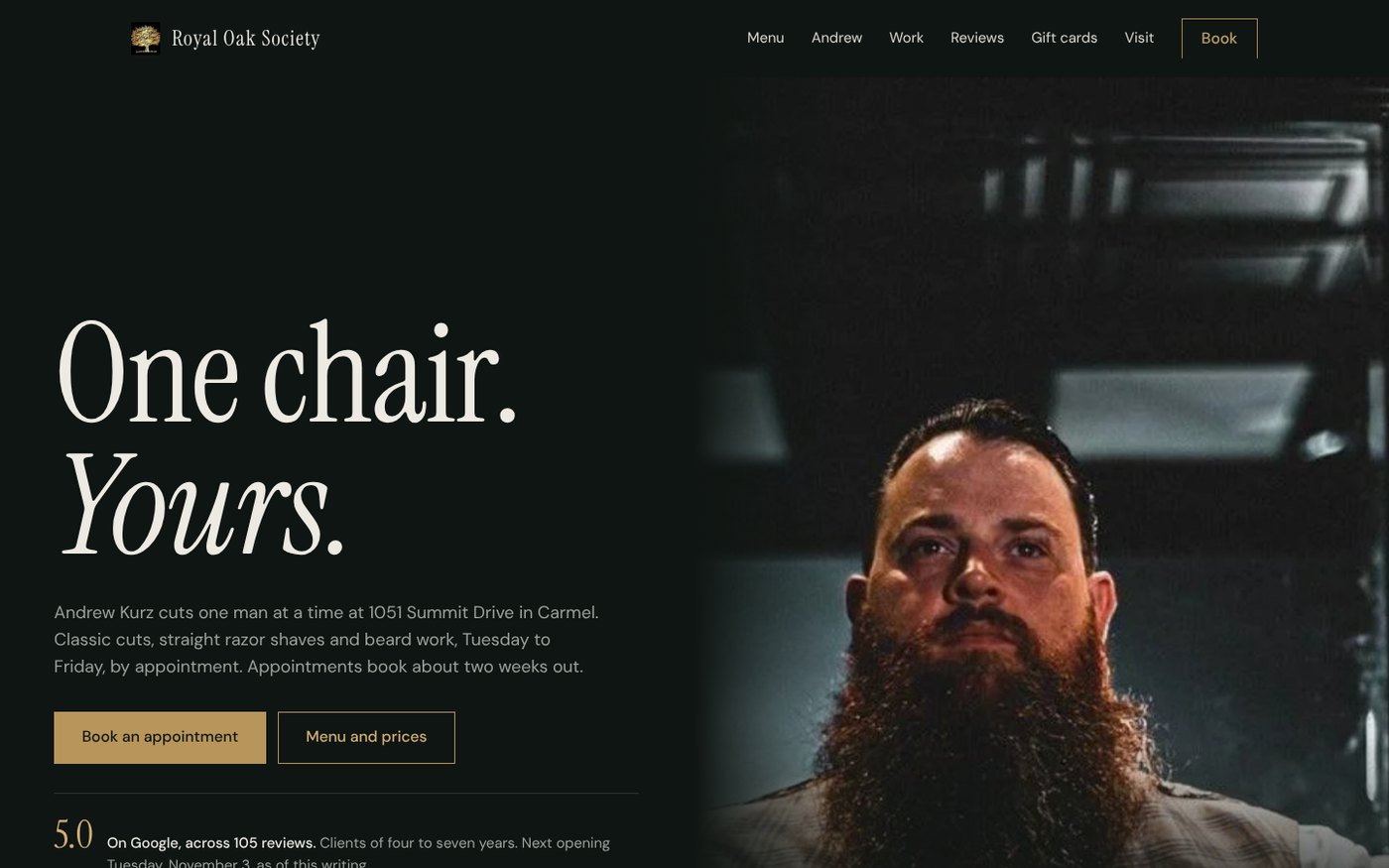
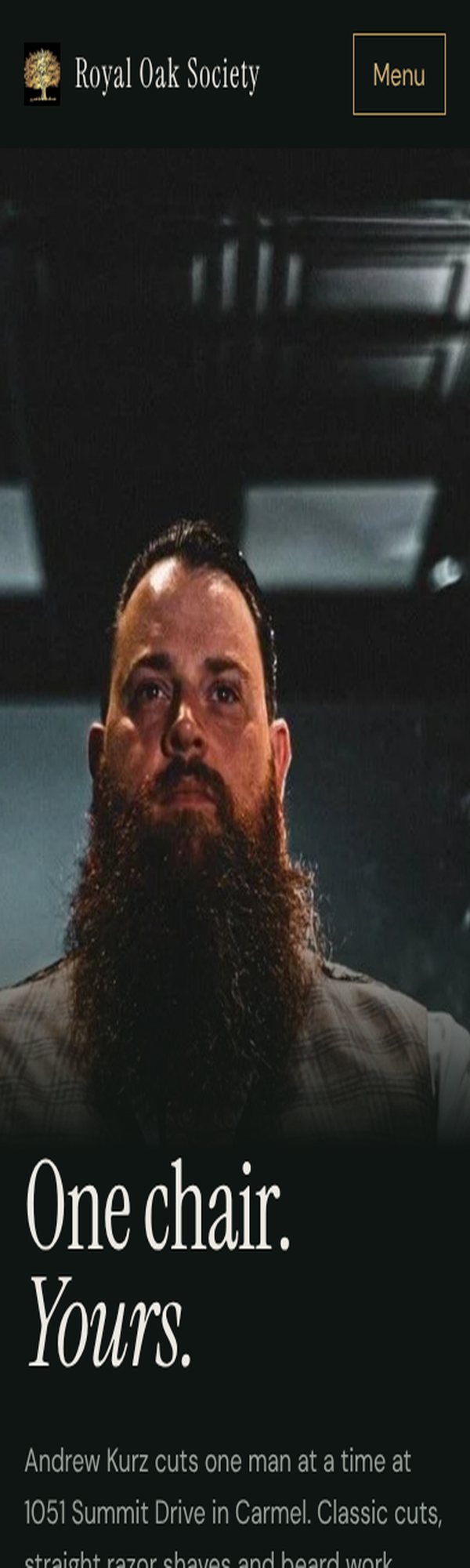
Three directions before one. A stone-and-brass "society card," this dark portrait-led page, and a bright proof-first page built around his haircut photos. The portrait direction won: for a one-chair shop, the man is the brand, and this is the only version where you feel him before you read a word.
Green-black from his own portrait, not the black of his current site. The photo's shadows are a deep teal-green. Using it as the page color makes the portrait and the page one object instead of a picture pasted onto black. Brass stays, but only on the wordmark, the prices and the buttons.
Instrument Serif at poster size. "One chair. Yours." in a tall, slightly condensed serif is the whole pitch in three words. DM Sans does the quiet work underneath.
Prices first. Each menu row leads with the price at 48 pixels, then the service, then the time. The one thing the current site withholds becomes the thing you can't miss.
Reviews as text. Three real quotes, set large, with first names and the source. Screenshots can't be read by a phone's zoom, by a screen reader, or by Google; text can.
A form for gift cards and first-timers. Gift cards are a real revenue line for a one-man shop, and his site only offers them through the booking software. The concept adds a working inquiry form with validation and a sent state, confirmed with a live test.
What a real client gets
This page with the brackets filled in (a shop email, his Instagram and Facebook links, who answers the form), the next-available date pulled from Squire automatically, and reviews that update themselves. Hosting and the form are included in the monthly fee.