Work / Hollis & Vine Hair Studio
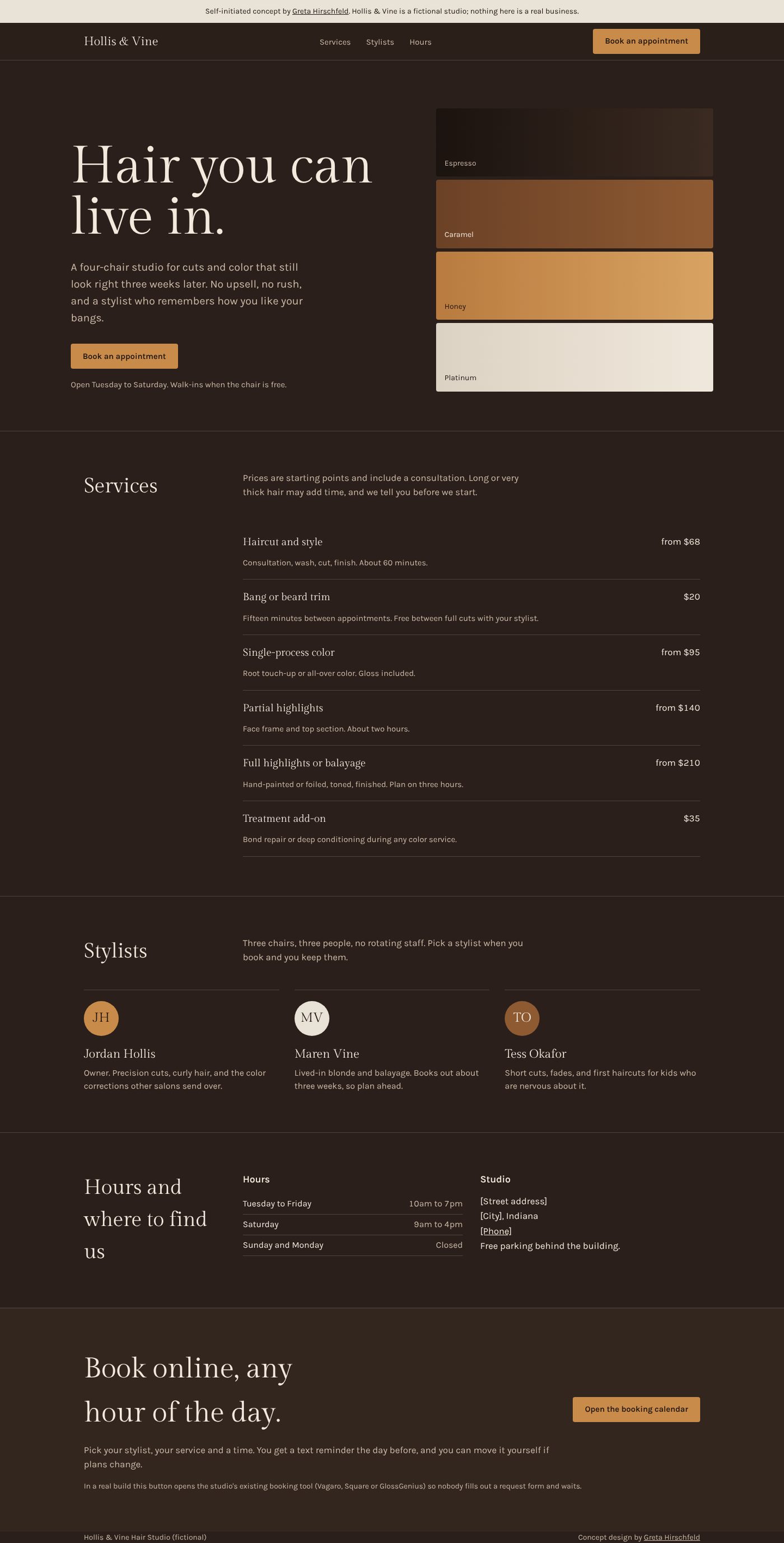
A salon site that shows the price before you have to call.
Most salon websites I audit in Carmel and Westfield share the same problems: no prices, hours hidden or missing, booking through a request form that gets answered tomorrow, and a page of stock photos that could be any salon anywhere. This concept fixes those on one page.
- Industry
- Hair salon
- Type
- Self-initiated concept, one page
- My role
- Design, copy, build
- Preview
- Open the concept site
Who it's for
A fictional four-chair studio with three stylists and a loyal local clientele. Its customers are mostly women 25 to 55 who found it through a friend, checked the website on their phone, and want two answers fast: roughly what will this cost, and can I book right now.
Goal. Turn a phone visit into a booked appointment in under a minute, and make the studio look like somewhere you'd trust with your color before you've seen a single photo.
Constraints I set myself. No stock photography, because small salons rarely have good photos on day one and stock makes every salon look the same. Real-looking prices as starting points, the way a salon actually quotes. Everything on one page, so there's nothing to maintain but the price list and the hours.
Design decisions
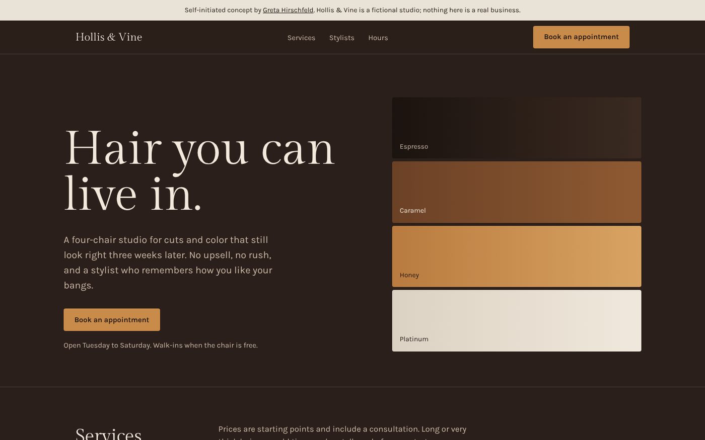
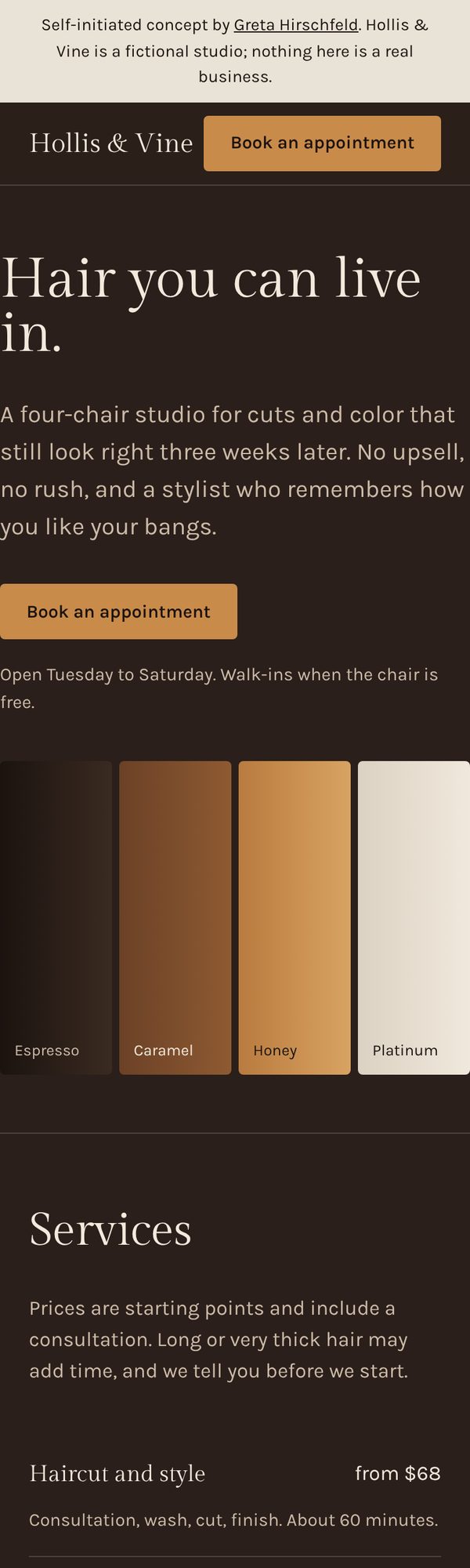
The color range is the imagery. Four stacked swatches, espresso to platinum, stand in for the photos a new salon doesn't have yet. They say "we do color" faster than a gallery would, and they give the page a visual anchor that's unmistakably about hair.
Dark background, warm type. A deep espresso page with ivory text feels like evening in a salon rather than a dentist's office. The single honey accent is reserved for the one thing we want tapped: booking.
Gilda Display for headlines, Karla for everything else. A high-contrast serif gives the name some ceremony; a plain, sturdy sans keeps the price list readable at a glance on a phone.
Prices as a list, not a PDF. Service, starting price, one line of what's included. The "from" is honest about hair length and the note above the list says so out loud.
Booking sends you to the real calendar. In a client version the button opens the studio's existing booking tool (Vagaro, Square, GlossGenius) in the same tab. No "request an appointment" form that creates work for the front desk and a wait for the customer.
Stylists by name, with no headshots required. Monogram circles in the brand colors mean the team section looks finished whether or not anyone has had photos taken.
What a real client gets
The same structure built in their fonts, colors and real information, their actual stylists and prices, their booking tool connected, and the page live on their domain. Where the concept uses [brackets], a real build uses the truth. Nothing here depends on photography, and everything on the page is something a front desk could update in five minutes.