Work / Northline Pilates
A studio site written for the person who has never been.
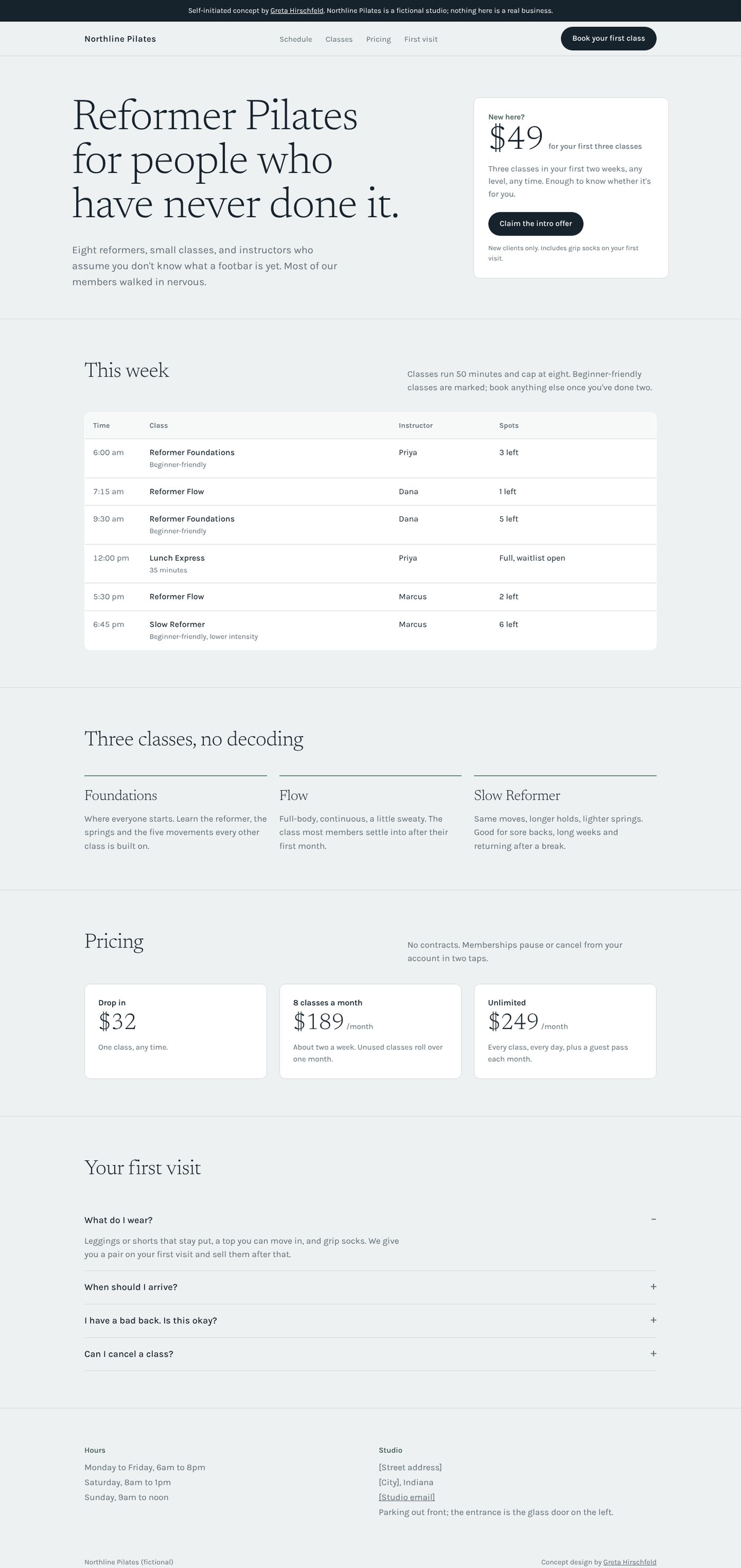
Boutique fitness sites are usually written for members: class names nobody outside the studio understands, a schedule hidden inside a third-party widget, the intro offer two scrolls down. The best new customer is the nervous one, so this concept talks to them first.
- Industry
- Reformer Pilates studio
- Type
- Self-initiated concept, one page
- My role
- Design, copy, build
- Preview
- Open the concept site
Who it's for
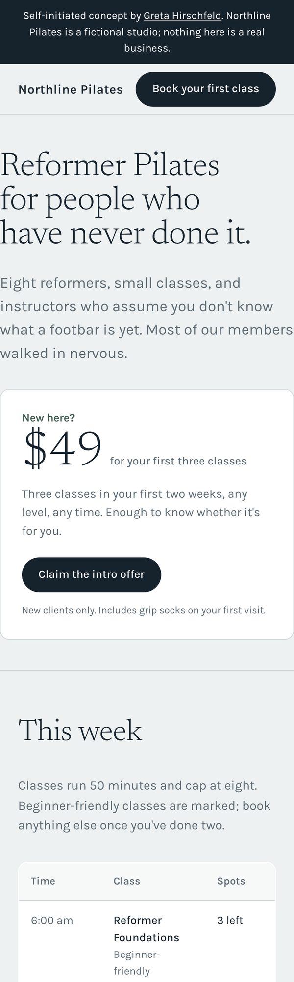
A fictional eight-reformer studio in a suburb like Westfield. Its growth comes from first-timers: people who've heard Pilates is good for their back, saw a friend's post, and are half-convinced they'll embarrass themselves. They're looking at the site on a phone, often at night, trying to decide whether to book.
Goal. Get a first-timer to claim the intro offer, and answer the questions that stop them (what do I wear, will I be the only beginner, what if I have to cancel) before they have to email.
Constraints I set myself. A schedule you can read without an embed, three class types described in plain words, and pricing that includes the drop-in so nobody feels tricked into a membership.
Design decisions
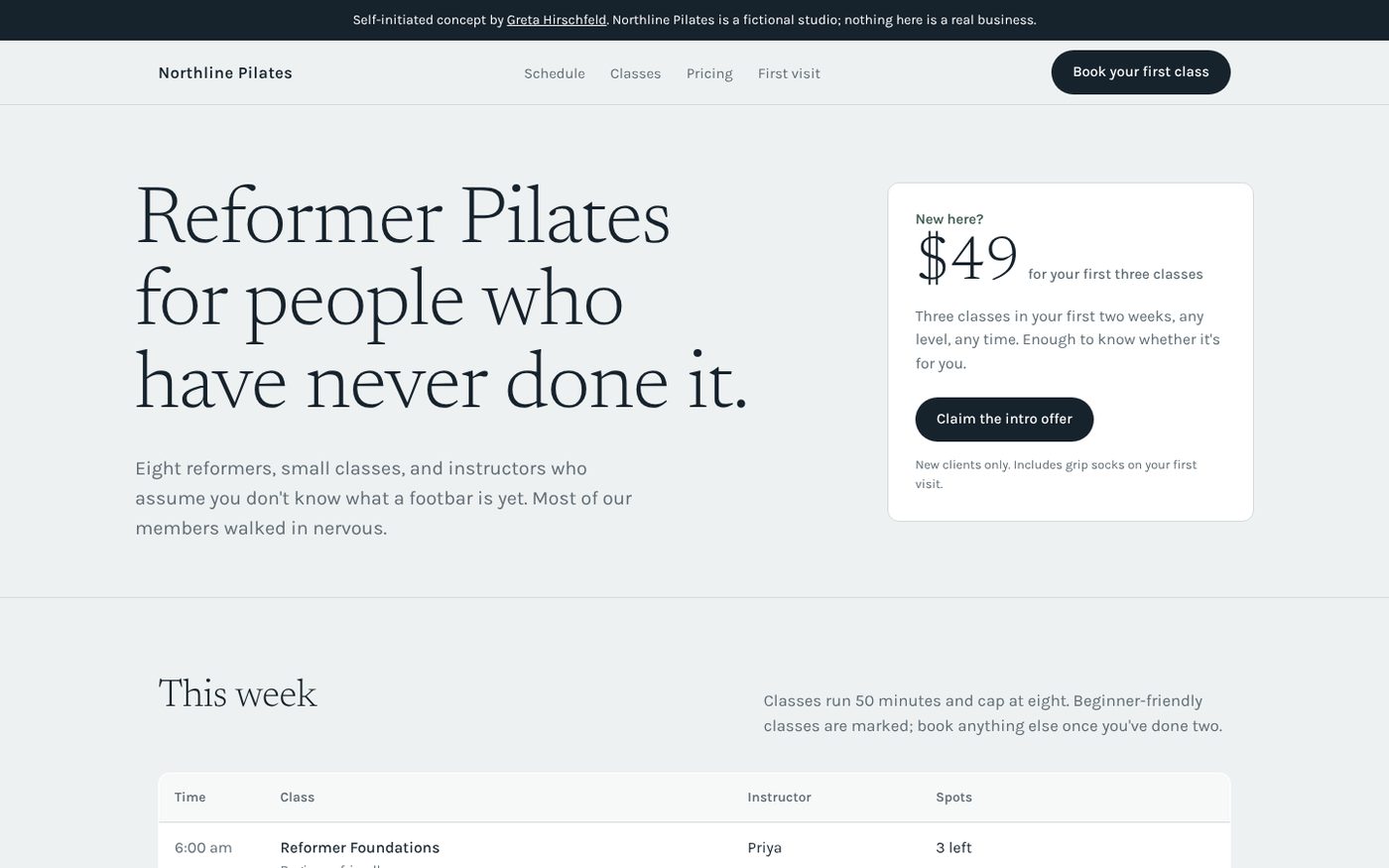
Pale fog instead of white, ink instead of black. Pilates studios are calm rooms. A soft grey background with deep blue-grey type keeps that feeling, and white panels lift the schedule and the offer off the page without a single drop shadow.
Newsreader Light for headlines. A thin, slightly bookish serif at very large sizes reads as unhurried and grown-up. It's the opposite of the shouting condensed sans most fitness brands use, which is the point: this studio is for the person who isn't sure they belong in a gym.
The offer is a card, not a banner. One price, what it buys, one button, one line of fine print. It's the most important thing on the page, so it gets the most contained, most readable shape.
A schedule you can read. Time, class, instructor, spots left. Beginner-friendly classes are marked right in the row. In a real build this table comes from the studio's booking system so it's never out of date.
First-visit questions get a section of their own. What to wear, when to arrive, what if my back hurts, can I cancel. They're the real objections, and answering them in writing is cheaper than losing the booking.
Three classes, named plainly. Foundations, Flow, Slow Reformer. A newcomer should be able to pick one without a glossary.
What a real client gets
The same structure built around their classes, their schedule, their instructors and their intro offer, with their booking system connected so the schedule and the offer button both go to the real thing. Photos of the studio slot in where the white panels are if they have good ones, and the page still holds together if they don't.