Work / SCULPTiv
A fitness site that starts with a quiz, not a before-and-after.
SCULPTiv is an at-home strength and nutrition plan for women who keep starting over: true beginners, people coming back after a long break, and people starting later in life. I founded it, and the website is the whole storefront.
- Industry
- Fitness subscription
- Type
- Live product, ongoing
- My role
- Founder. Brand, copy, design, build
- Live site
- joinsculptiv.com
The goal
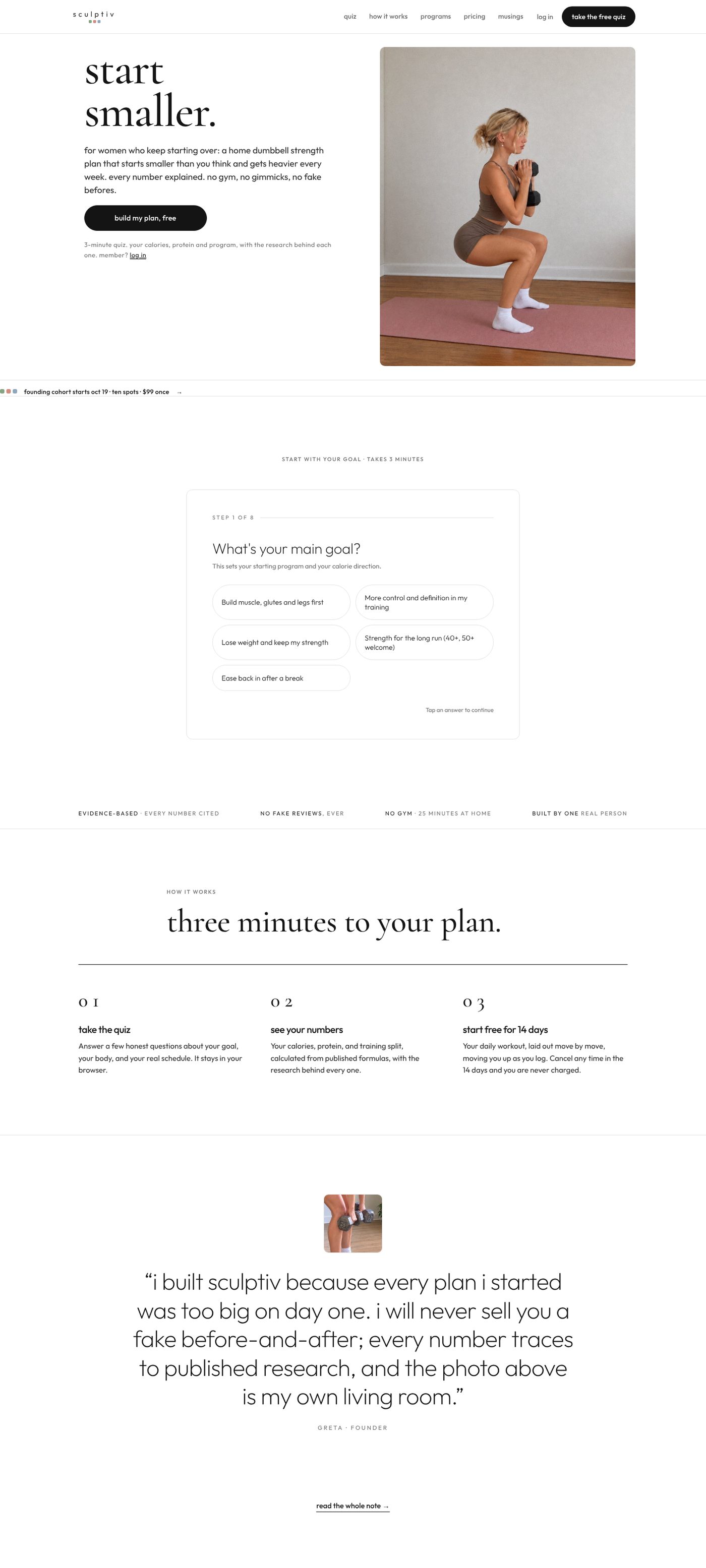
Get a nervous beginner from the homepage into a free three-minute quiz without making her feel judged, then into a 14-day trial. Every other fitness site in this space sells transformation photos. SCULPTiv's whole point is that it doesn't, so the site had to earn trust with words and calm instead of bodies.
Constraints. No appearance or weight-loss framing anywhere. No invented numbers or fake testimonials. Faceless in the product, founder-forward in the marketing, identified by first name only. A tiny budget, so no paid tools, and a founder who is also a full-time student, so the site has to be easy to edit in an afternoon.
What I did
- Brand: the name, the lowercase wordmark with three small color squares, the "start smaller" idea that runs through the product and the copy
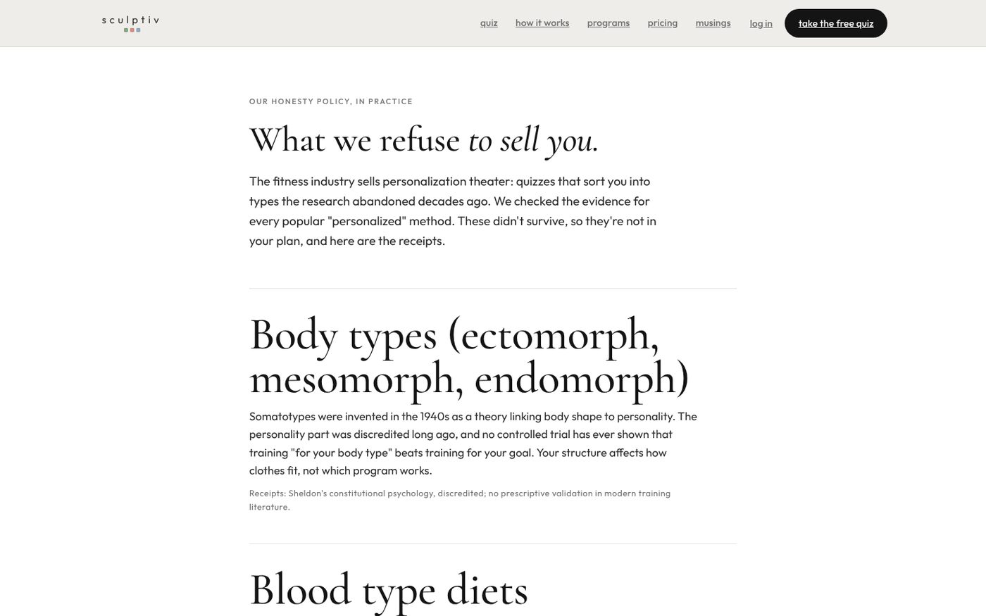
- Copy: every page, including a public honesty page that lists what the company refuses to sell
- Design: typography, color, layout and the photo direction, shot in my own living room
- Build: the public pages, the quiz, pricing and checkout flow, a member hub behind a login, a blog, and a printable journal that mirrors the site
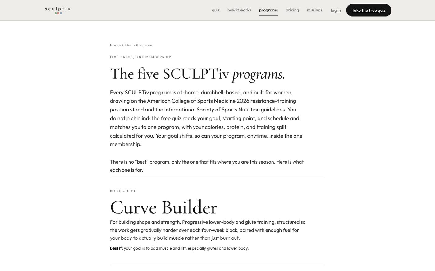
- Everything since: analytics, hero changes made after watching where people clicked, a programs restructure, and the small weekly edits a live site needs
Early technical implementation was shared with a collaborator. Since fall 2026 I design, build and ship the site on my own.
Design decisions
Two typefaces doing opposite jobs. Cormorant Garamond for headlines, set large and lowercase, so the page reads like a quiet editorial rather than a gym. Outfit, a geometric sans, for everything you have to act on: buttons, navigation, form labels. The contrast tells you what's a thought and what's a control.
Lowercase everywhere. The brand's voice is a friend talking, not a coach shouting. Lowercase headlines, navigation and buttons carry that without a word of explanation.
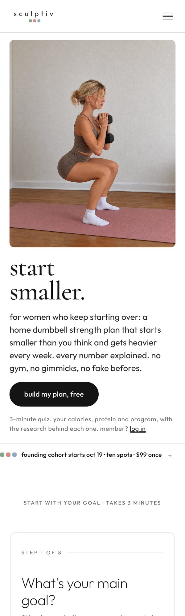
One photo, one person, one action. The hero shows me mid-rep in socks on a mat in a normal room. No gym, no filter, and the alt text says exactly what's happening. For an audience that's intimidated by fitness imagery, an ordinary room is the reassurance.
Black pill buttons on warm white. A single high-contrast button style so the next step is never ambiguous. The three small color squares under the wordmark are the only decoration on the page.
The quiz is the homepage. After testing, the quiz moved directly under the hero and the button copy changed to "build my plan, free". People shouldn't have to find the thing the whole site exists to offer.
Outcome
The site is live and selling. SCULPTiv passed 100 members in August 2026 with no sales team and almost no ad spend; this site is the only place anyone can join. It's an ongoing project, so the current version is always at joinsculptiv.com.
What it taught me for client work: the words matter more than the visuals, the phone version is the real version, and the fastest way to improve a site is to watch where people actually click and move that thing up.